Abstract calligraphy
Abstract, free, gestural calligraphy
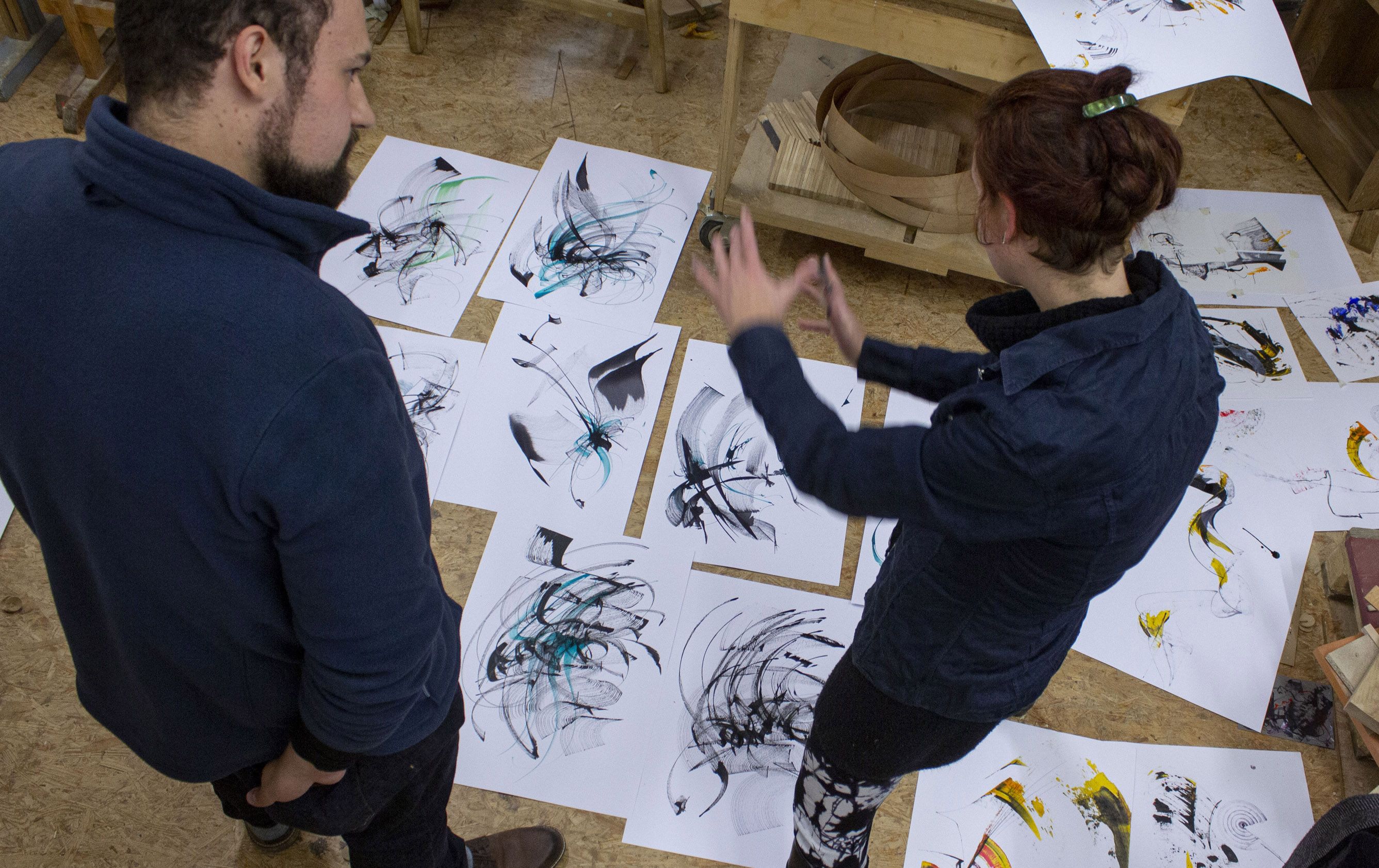
One of our major subjects is the so called »abstract calligraphy«, or »free calligraphy«, or »gestural calligraphy«. This special form of calligraphic expression differs from formal calligraphy, whose main focus is the creation of readable characters.
Free calligraphy lets you experience the criteria for a perfect calligraphic movement before this movement becomes a readable glyph. This allows you to evaluate the quality of your calligraphic stroke. Whether you create readable or non-readable glyphs: the goal is to achieve the highest quality. In this context we use the term »Formqualität« – which literally translates to »quality of shape« – to describe the visual quality of a calligraphic work. Whether formal or abstract calligraphy, historical scripture or contemporary logotype: the quality of shape should be as high a possible.
Quality of Shape
What exactly is quality of shape? It is difficult to put into words.
We have achieved the highest quality of shape if nothing can be added to nor removed from the calligraphic stroke; when a better version of it is inconceivable. This concept of quality also applies to other forms of expression, such as music or dance. The performer knows it instinctively because they learned to perceive mistakes in the creative process.
To a layperson it might be easier to explain quality of shape by comparing good and bad examples – and of course simply by trial and discussion with an experienced instructor.
Every calligraphic movement can be of high quality of shape no matter how improvised or spontaneous it is. With beginners it is often these spontaneous, unplanned strokes that have the highest quality. By practice you will be able to achieve better results more frequently and turn random successes into planned ones.
Which factors are crucial in achieving the highest quality of shape in the context of free calligraphy? A combination of working conditions, manual skills and personal factors.
The right tool for the job
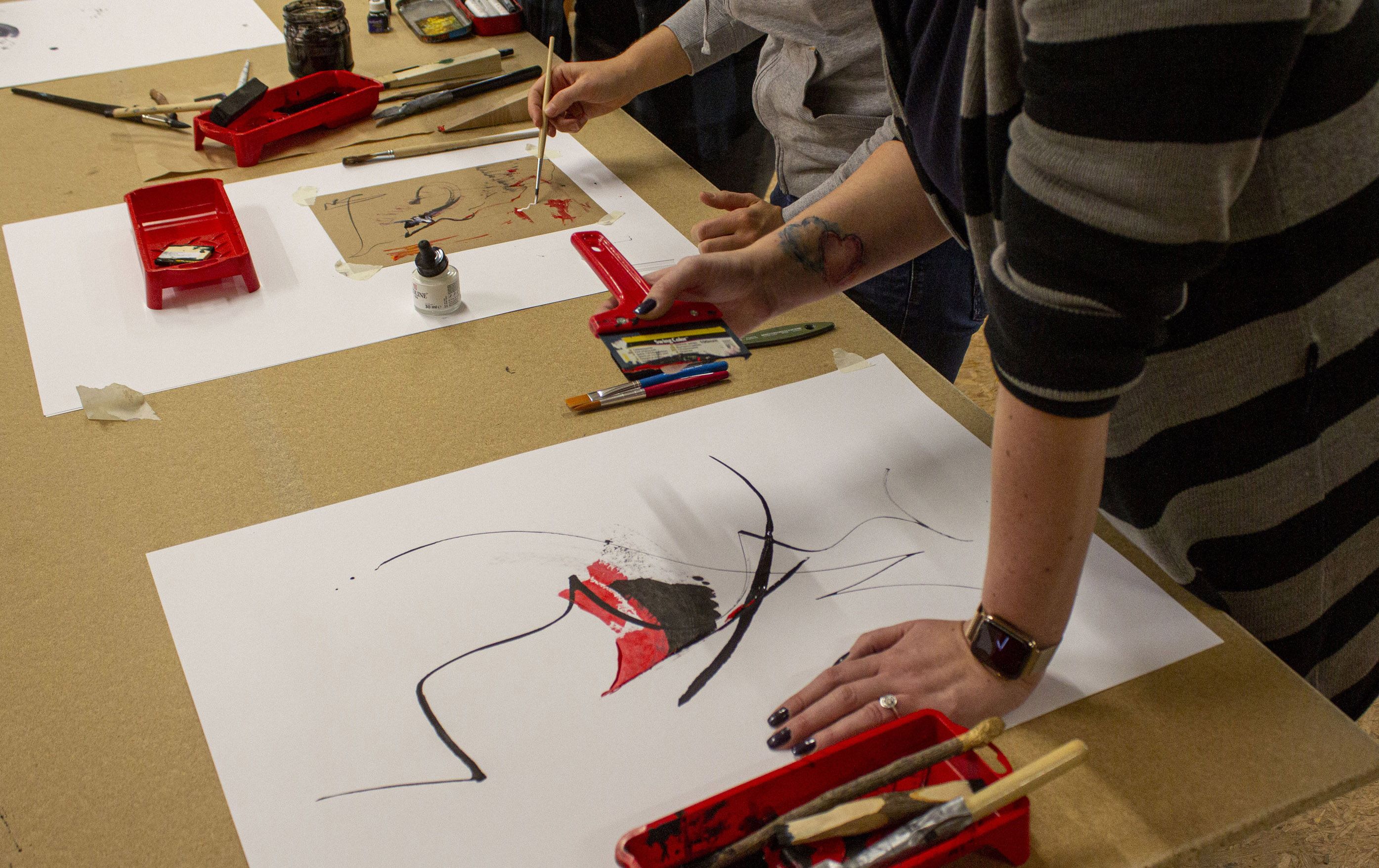
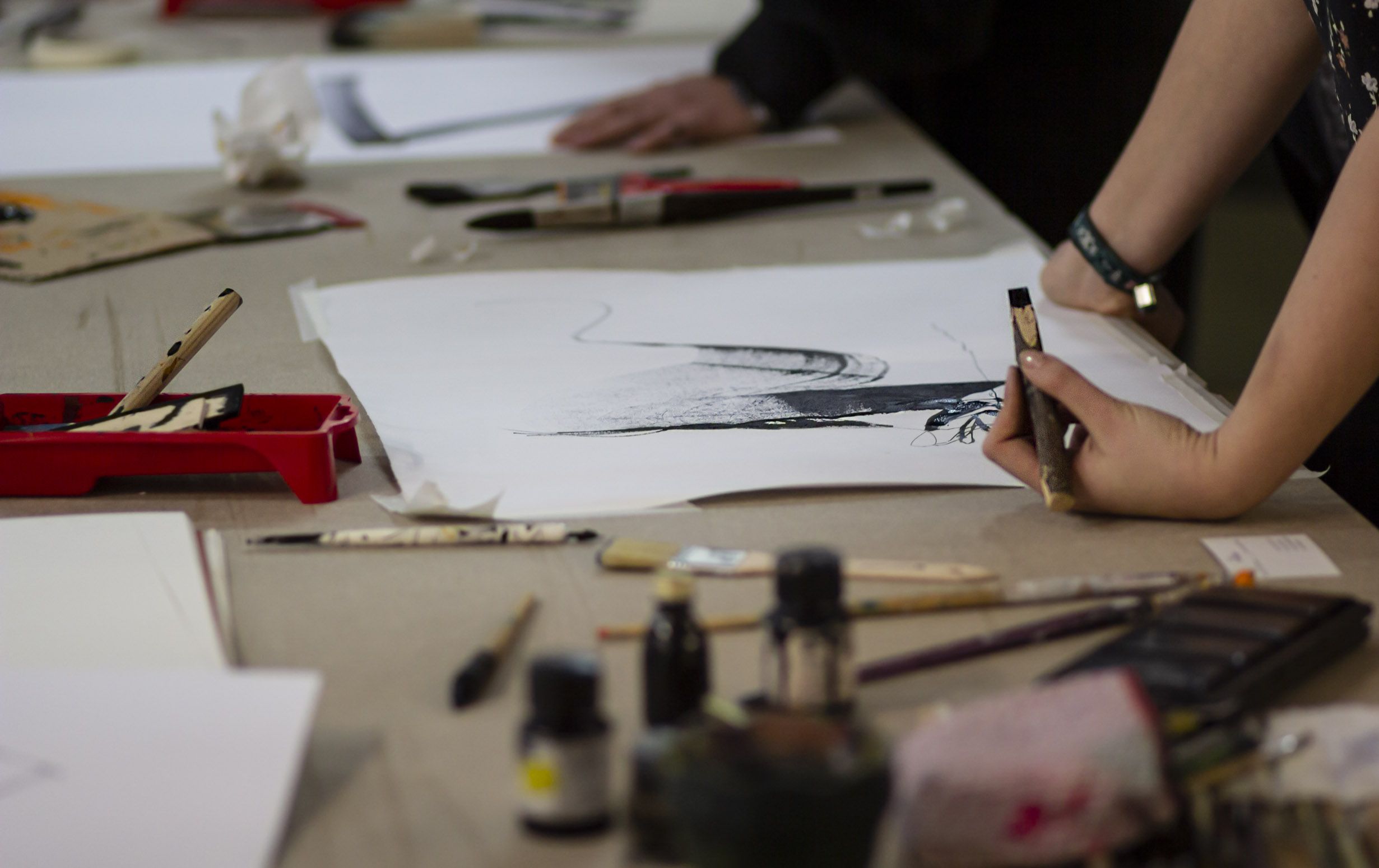
Calligraphy is practiced with writing tools – therefore the quality and the knowledge of the tool that comes into use is very important. The deciding factor of a tool's influence on the figure is the shape it takes when touching the paper. Writing tools are categorised by this criterion. Broad tools create a high contrast in stroke width, so vertical strokes are usually thicker than horizontal strokes (independent from the amount of pressure applied to the tool). They are rigid and have a sharp and flat edge. This class of tools contains broad nibs, broad brushes, broad wooden tools, Parallel Pens, Automatic Pens, spatulas, scrapers and many more.
Another class of tools has pointed and flexible tips that create a variable stroke width with more or less pressure on the tool. Examples include pointed nibs, pointed brushes or brush pens. There also are stub nibs and other tools that create a consistent stroke – however, these are not quite as relevant in the context of free calligraphy.
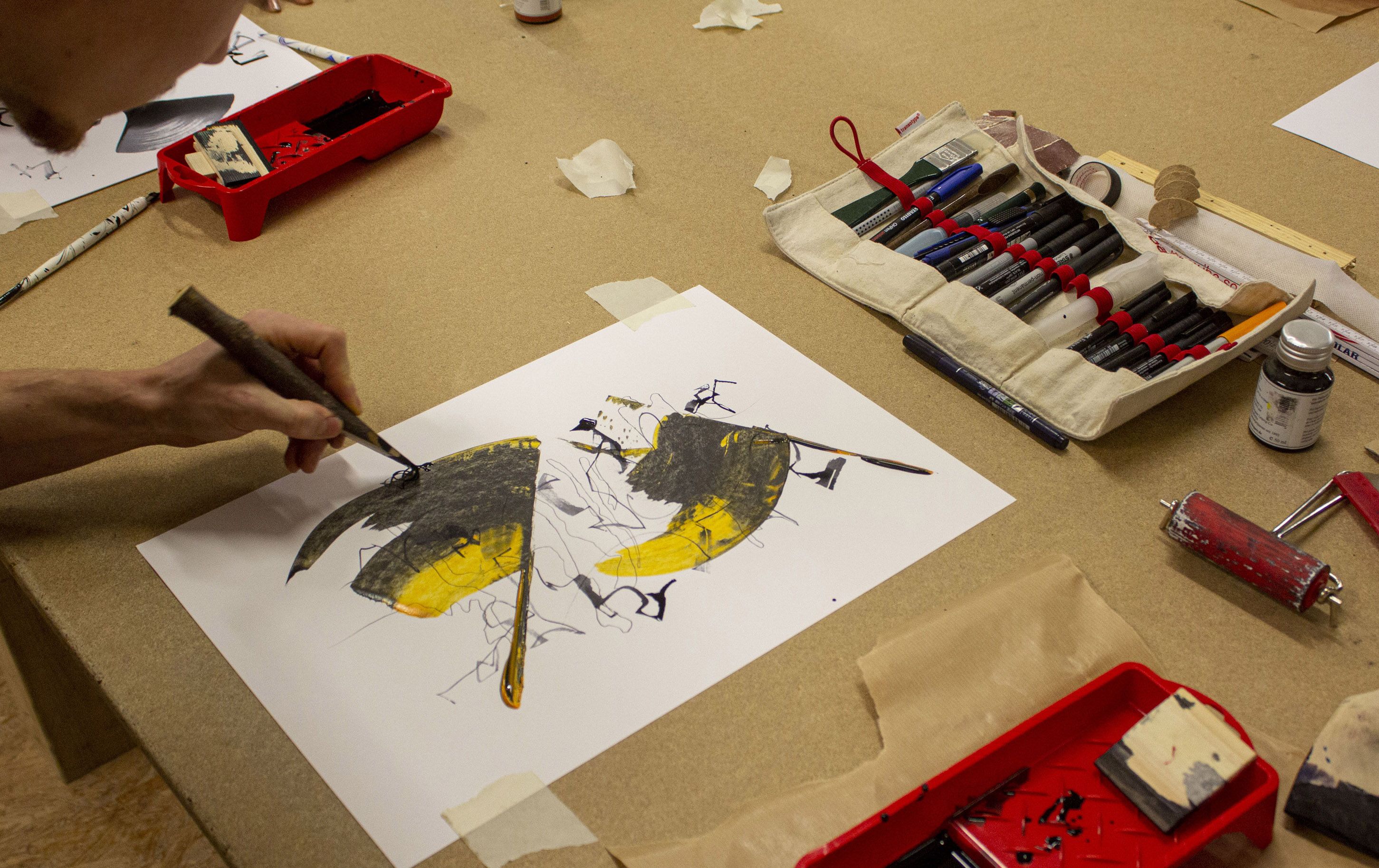
In addition to the tool, the selection of the writing surface (usually paper) and writing fluid (mostly ink) is important as well. Practicing and experimenting with different tools, inks and papers is essential, as it allows you to explore how these components work together. For beginners it is recommended to start with an easier to control rigid broad tool rather than brushes, which require some advanced skills. Here you can experiment freely. A simple tool carved out of wood with a sharp edge may give a better result than an overpriced calligraphy set from the art supply store.
To achieve high quality results you also have to take a look at how you grip your tools and your overall posture while practicing calligraphy. And of course you have to ensure that your working conditions are as good as possible: lots of space, a pleasant temperature, appropriate lighting conditions and an overall positive working atmosphere. Be sure to take care of this regardless of whether you work on your own or in a team. These factors are very important and – if chosen with care – will help you improve your skills with more diligence and discipline.
A general interest in design and manual work is certainly an advantage - but other than that, there is no real prior knowledge necessary to perform free calligraphy. This makes it accessible for virtually everyone. Free calligraphy might be a bit easier for beginners compared to traditional formal calligraphy with its higher demands in practice and skill.
In addition to quality of shape there are many other design principles that can be found and applied in free calligraphy: interaction and arrangement of elements (composition), building of tension, compression and dilation, rhythm, use of colour, use of contrasts, use of format, compositional order/randomness, creating a series or a single work, choosing between different pieces and why, naming a piece, presenting your work, …
A major discovery you might make while practicing free calligraphy (or any other design discipline) is: time does not equal quality! The first stroke you put on a canvas might be perfect and it may take you forever to reach that quality again. Training and feedback will help you to eliminate random results and to achieve higher quality more frequently.



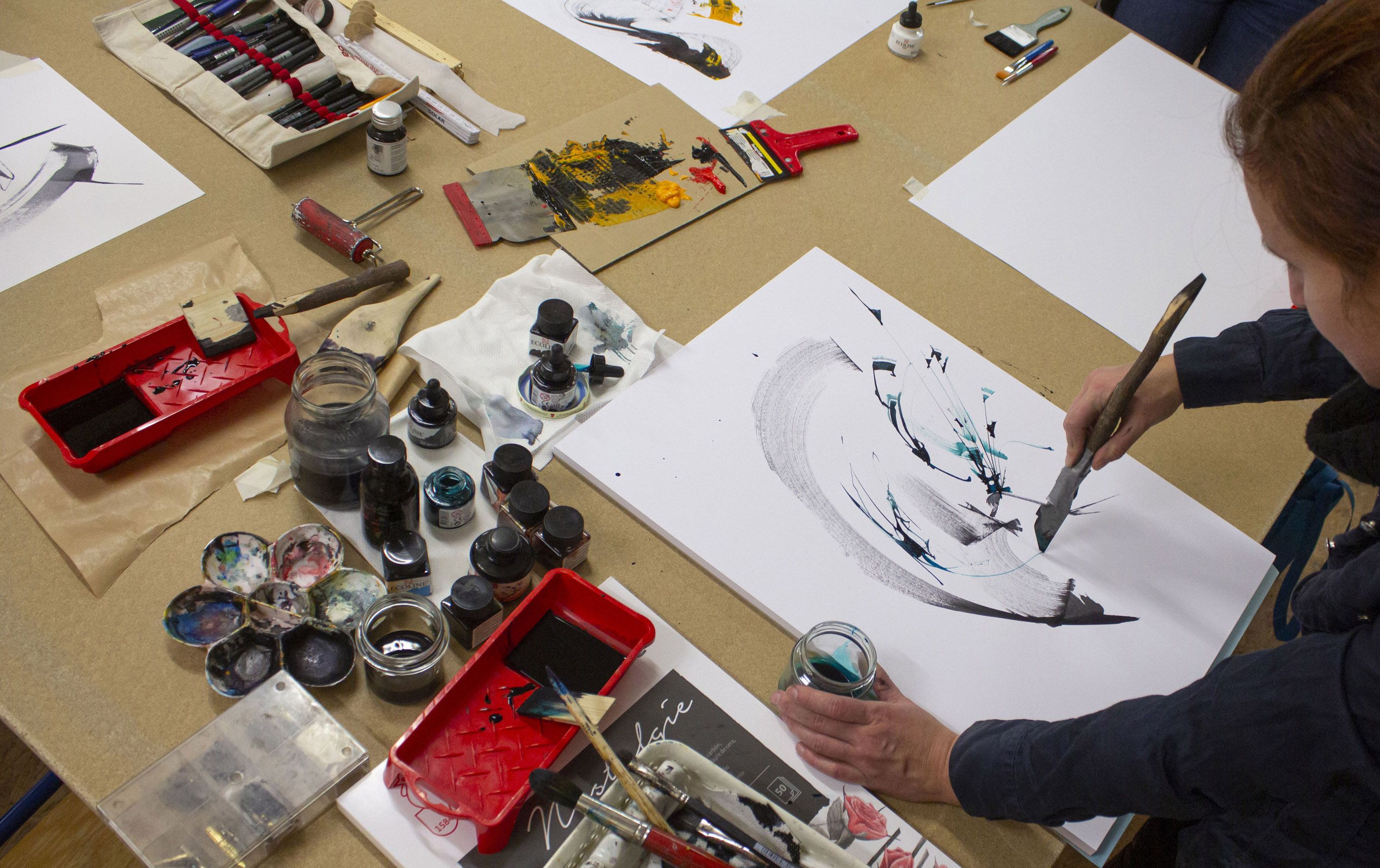
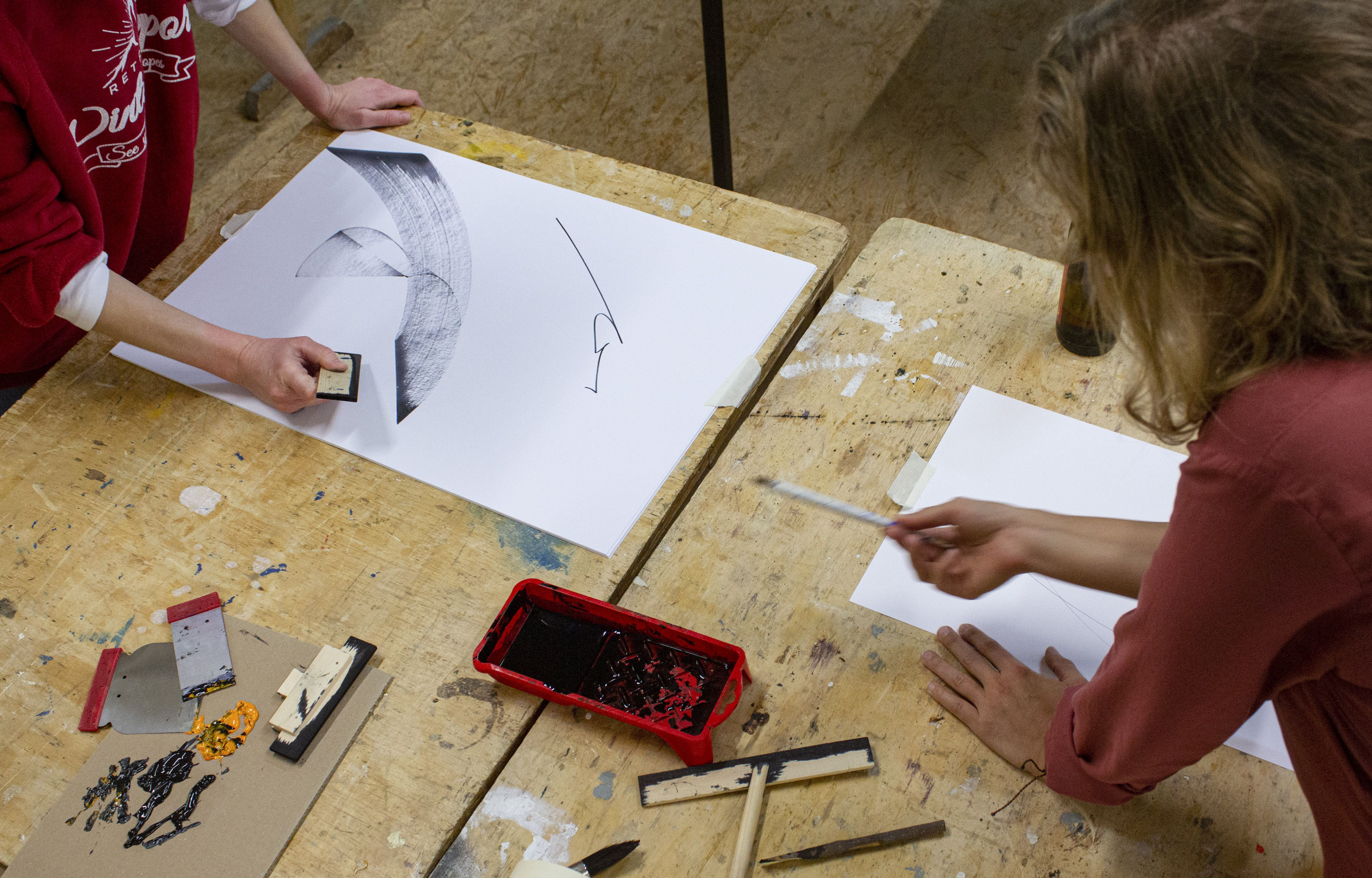
Abstract v. Formal calligraphy
In formal calligraphy, each calligraphic figure is part of an established, functional canon. It becomes a glyph, a sentence, a paragraph or an ornament.
The abstract calligraphic figure is what it is. In terms of Theo van Doesburg it is concrete rather than abstract. About »concrete« painting he writes: »[…] Concrete and not abstract painting, because nothing is more concrete, more real than a line, a color, a surface. On a canvas, are a woman, a tree or a cow concrete elements? No - a woman, a tree, a cow are concrete in the natural state, but in the state of painting they are far more abstract, more illusionist, more indeterminate, more speculative than a line.« (van Doesburg; Holz, Geistesgeschichtliche Koordinaten, translated by author)
In this sense, the calligraphic figure is a pure figure and confined to its own shape - it is self-referential. It can simply be what it is, it does not have to pretend, it does not have to depict or symbolize anything, and it is not subject to conventional criteria like a line of a drawing or a letter.
On one figure, others follow. They interact, contrast, cross and overlap. Sometimes, a more complex structure emerges. And just like it is with handwriting, these calligraphic structures can usually be clearly matched with their respective author.