Letter spacing
The spaces between the letters of a typeface have a significant impact on its legibility. They can affect or even destroy the aesthetic shape of the word. I propose that there is — especially in lower case — a correct amount of letter-spacing, with little variability.
Capital letters can usually be set more lightly. Many typographers, however, squeeze their letters together — even to the point of contact. Manual adjustment of letter spacing, which should be applied especially with capital letters, is a length very few seem to go to — all the more reason for type designers to deliver properly kerned capital letters.
Lowercase Letters
Historically, letterspacing has been treated with varying degrees of care. For example, Schönsperger's printed blackletter is not optimal — especially compared to its handwritten counterpart by Leonhard Wagner.
Sans serif typefaces as of the 19th century have had a distinct technical character. Metric was preferred over optical kerning. These geometric letters were usually set as closely as possible. Filmsetting in the 20th century reduced the spaces between letters even more — to the point of contact and, beyond, even overlap of letters (at the expense of legibility!).
In the past, specimens of typefaces were presented predominantly alphabetically. This suggests the assumption that defining the spaces between letters has historically not been a priority. Even today, most type designers create letters more or less alphabetically — kerning, i.e. setting the spaces between letters, is a second step.
When designing letters, one should develop the first three to five letters together with the shapes between them — and design each additional letter in the middle of a word with letters in front of and after it. For this I can highly recommend the software Glyphs— It's »Edit-View« makes it easy to design letters in the context of a word.
Keep in mind that each letter — just like each human who is supposed to read it — is an individual. A lowercase r is not just half of an n, an n is not just a u rotated by 180°. Modular design with predetermined letter parts is not a practice I would endorse.
Dual Volume
The space between to glyphs is what I call a Dual Volume (DV) — dual in the sense that it is created by the spaces between two adjacent letters. DV, however, is not just the sum of the right bearing of one and the left bearing of another letter: the spaces making up the DV partially wrap around the letters and have, therefore, a bigger volume. The more open the shape of the letters, the harder it is to determine the DV: A part of the space within a C should remain unaffected, and a T need some space around its leg.
A point of reference for lowercase letters
The DV amounts to roughly 90% of the space inside an n. I propose this is true for all weights of a typeface.
The paradigm of "setting small sizes wide and big sizes tight" is absurd — increasing tracking in small sizes will lead to wider spaces between the letters, but have no effect on the spaces inside the letters.
In this context I would like to quote a design exercise I have been asking of my students — more than 2000 over the course of 25 years — in the first stage of their studies:
Task:
- Font choice: One sans and one serif text typeface, regular, accessible to students on their computers.
- Text: Ca. 7 lines of left-justified text.
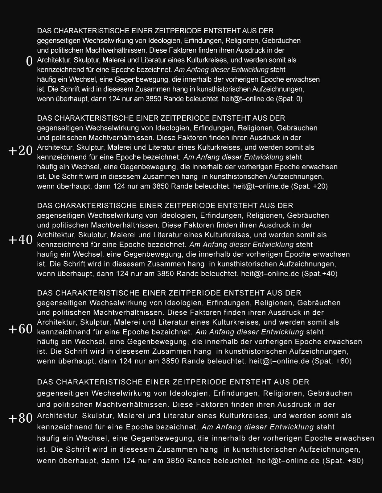
- Create a series of increasing tracking (0 up to 140) in increments of 5, 10 and 20.
- Print in high resolution and choose the optimal specimen after aesthetic and functional criteria.
The surprising result: Over the course of 25 years, the vast majority of over 2000 students chose the serif specimen with +45 tracking and the sans specimen with +55 tracking. I use and will continue to use this exercise in my classes and seminars (see fig. 3)
This result raises the question whether the responsible phototype fetishists — selling their typefaces worldwide — work with an irresponsible superficiality or whether they simply work in an unreflected manner. The good intention of conserving resources (printing paper) is ruined by the illegibility of text without sufficient DV.


A Reference for Capital Letters
Since capital letters have a higher degree of variation regarding DV, there is a minimum which mostly depends on L, LA, T, V and W. The examples in fig. 4 and fig. 5 were set without adjustment. If there is no L, A, T, V or W in, say, a headline, it may be set tighter. Several vertical shafts in a row (see fig. 6) are almost always set too tight.
Changed standards for precision
Finally it must be set that the typographer usually has to fix what the type designer / producer failed to implement. Units of measurement dating back to lead typesetting are used and taught to this day — while this is not wrong, you can hardly call these specific, discrete units precise in the 21st century.
The possibilities of digital typesetting considerably surpass those of lead typesetting. They require a keen aesthetic sense as well as typographic knowledge in order to display type in an aesthetic and accessible way.
Conclusion
The spaces within each individual lowercase letter determine tracking to ensure optimal legibility. Nothing else!